

Time is an app that uses gesture as a core mechanic to quickly keep track of time spent towards client projects and your own projects. The main goal is to simplify what is usually considered a laborious task and make it an enjoyable experience.
role: designer
Problem
Doing time sheets is widely regarded as a hassle among employees. It is however an integral part of a business. It can be used as a measurement with progress to verify your standing with timelines or a reminder of the cost of past similar work. Without fully getting in to a deeper conversation about the arguments for or against the practice of time sheets, how can this process be made more painless and perhaps even enjoyable..
What is it about time sheets that makes people groan?
common responses
- takes too much time to track time
- employees often fake time to hit a certain number
- time keeping apps can be overly complicated
What currently exists in this space?
There are a number of apps available that offer time tracking. Many offer unnecessary features. Others were just missing the simplest of tasks, like deleting an entry or manually adjusting time.
Even if apps do provide all features they consistently offer an unsophisticated method of adjusting time.
Task
Create an app that respects the employees time, feels more like an ally than an enemy, and simplifies the process to core necessities. I focused on the iPhone so time tracking could be completed realtime in the office as well as in transit.
Wireframes
I started with the primary features for the app. What needs to be accounted for on each screen and how do these relate across screens? From there I created a wireframe flow that fleshes out content/button placement and feature interactions.
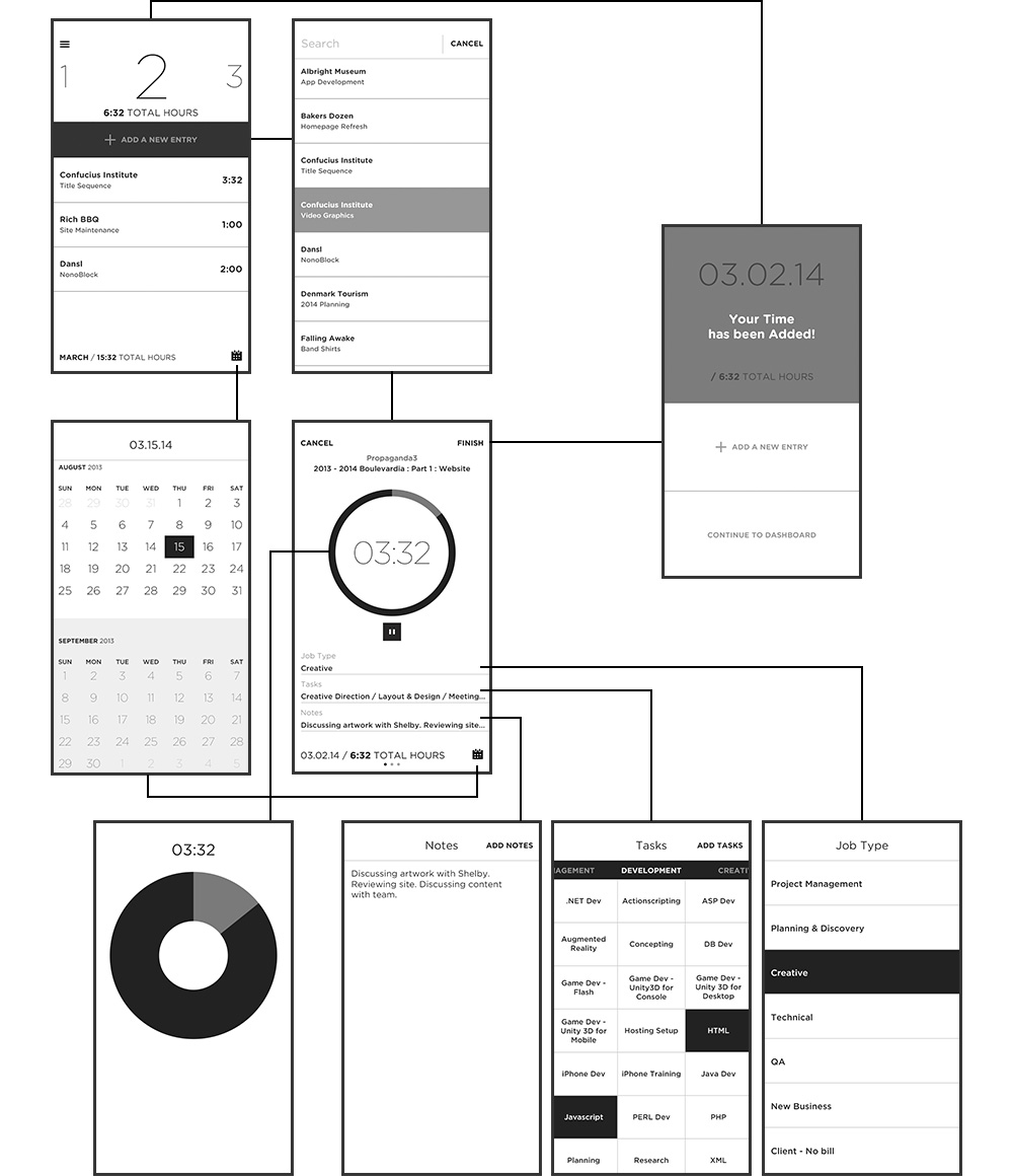


Press and hold to adjust time
The user can either press the play button to track in realtime or they can press on the time tracking circle to manually adjust time. A full circle equates to 8 hours. Once past the 8 hours, the color of the circle changes to indicate the new revolution.

The screens between the screens
Each screen transition is deliberately designed to serve as a roadmap to lessen the confusion of the users location in the app.

View the full days entries at the creation stage
Move side to side to adjust other entries from the same day. Accumulative time is displayed to get an accurate view of your day's total accounting.

Color to serve a purpose
The interface at the creation stage is designed with a darker tint to be less obtrusive while tracking time.

Importance of the "Reward Screen"
The reward screen acts as a pausing moment before moving to the dashboard or the creation of a new entry. This serves as a confirmation screen as well as a mental release between the act of logging time.

Create a Job
Creating a Job is a simple process. Existing Clients autofill based on keyboard input and choosing teammates for the Job are as easy as selecting them from your existing list of Time associates.

Job at a glance
Easily tracking the progress of the Job can be done throughout the app. Color coding becomes an aid for Jobs nearing projected completion. Orange means you're getting close, red and you're past budget. An overview offers more details regarding the time spent towards the Job and a Full Report goes even further by showing the break down of hours by Job Types.
